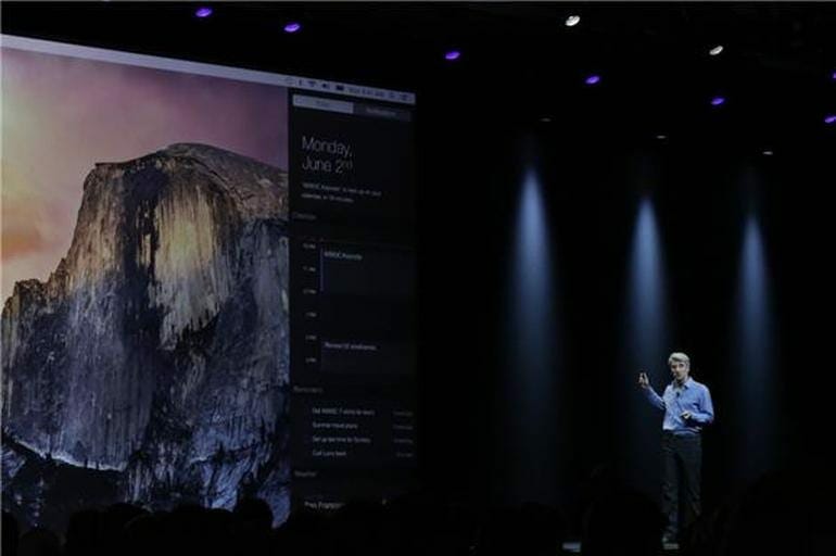
Finally Apple has unveiled Mac OS X Yosemite with new UI design and features. Apple is now taking a further step integrating Apple iOS and Mac OS X. This time most of the design is inherited from Jhon Ive iOS 7 design. Mac OS X Yosomite is the latest Apple operating system for computers bringing a lot customization and UI tweaks.
40 Million Copies of Mac OS X Mavericks has been sold uptill now. Adoption rate of Mavericks is now 50%. Accroding to Tim Cook, Windows 8 adoption rate is 14%. Computers market has been shrinked by 5%. But Mac market is growing.
In particular, Apple has well and good, moved away from naming there OS before cat names. We have got everything for you in this news.
OS X Yosemite 10.10 Features:
In this release, Apple has made big augmentations to apps and the whole UI in broad. The UI of OS X Yosemite is now similar to that of iOS 7. This was expected as well from the day we were getting leaks and news about the new OS X Yosemite. Everything in the UI has been tweaked from the ground up, from the app icons and to buttons allowing us to minimize and expand or close apps.
This was not available in the previous versions of the OS X. This has been added to the latest and state-of-the-art OS X Yosemite. The windows and menus all over OS X Yosemite have the same translucent and transparency effects which we are accustomed to in iOS7. This, by the looks of it, is the idea of Apple to provide you with something that you are already accustomed of.
Apple has made it worthwhile for the end-user. A perfect example would be the dark theme, which once enabled, lets the user to concentrate on the content he/she is working on. The Notification Center has gotten a new look as well and features like the all-new Today view, which made its cut with the release of iOS 7, which puts the focus on things relating to your day. Also with the new Notification Center, you can now have a whole bunch of widgets in one place, and you can have applications that ca export widgets. This is really amazing. Here are some other features:
- The main focus on OS X Yosemite is mainly the UI. Apple has really narrowed the difference between the UI of iOS 7 and its new Mac OS X.
- The new Calendar app now features a new sidebar that shows the user location information. It can prove to quite handy if you need your calendar events to be up front.
- Spotlight Search has also gotten a nice update in OS X Yosemite and now lets you view web results in a dazzling drop-down menu.
- Apple is today announcing iCloud Drive, which will allow you to sync content across Macs and is accessible through Finder. It is compatible with Windows too. Sweet move by Apple.
- The new Mail app looks a lot like the iOS 7 running iPad. Apple is making Mail a lot better by introduce MailDrop, which allows you to send massive attachments to the other user.
- Safari has also got a major refurbishment in this release. It features a single bar that handles all searches and URLs without the need to jumping into separate boxes.
Moreover the iMessage has been updated. With the new update on the iMessage, you can now receive messages across platforms (for example from your friend’s Android smartphone). You can now also take and make calls from your Mac, when your iPhone is in a particular range. Part of the new “hand-off feature” that means your computer and iDevice know exactly what the other are doing. A call to your phone will trigger a pop-up asking if you want answer right from your computer.
OS X Yosemite 10.10 Release Date:
OS X Yosemite will be available for public download in Fall 2014. But before that, you can register yourself for the beta version.
Share your thoughts regarding the OS X Yosemite!


