Google announced Material Design at Google I/O this year. Material Design offers a complete new look of how Android looks like. Google is gradually changing its apps according to Material Design and now according to Android Police, Google is changing the interface of Google Play Store according to Material Design.
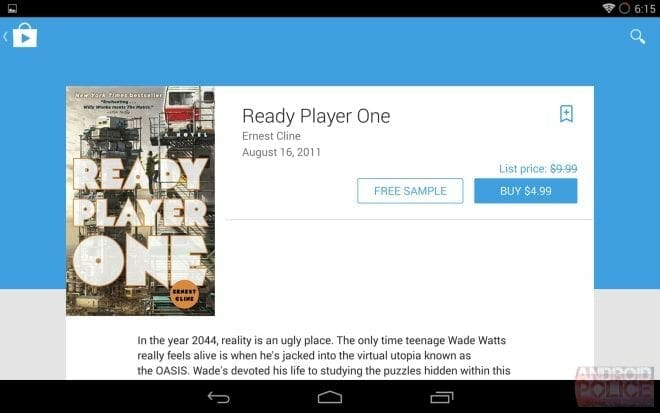
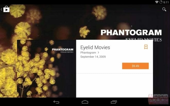
Google Sheets, Google Docs and Google+ are already benefited from Material Design and now its time for Play Store to get updated. Android Police has released some screenshots of upcoming updated Google Play.
You can see in screenshots the product page of different categories and how they look on tablet and smartphones. Now there are large images behind the app description. And you can tap the image to play the trailer of respective game or movie. Books and Magazines now have an extended header.
What do you think about new design of Google Play? Tell us about your views.


